Option Strategy Payout Diagram Example by Market Chameleon

  • What is an Options Payout Diagram?

    When you trade options it can be difficult to understand all your potential profits and losses. A payoff diagram can help you visualize your risk and rewards at different stock prices at expiration. This allows you to see how much you can potenitally make or lose for different stock outcomes.
  • Why do you need the payoff diagram?

    If you trade stock, your returns are linear with the stock price move. When the the stock price goes up or down by a certain percentage, you can easily calculate your returns. However, options returns are not necessarily linear with the stock. Especially when you can trade a spread or combination of options. You would have to aggregate the profits and losses at each stock price point for each option. This would be an extremely tedious task and is unreasonable. Therefore, we use a graphically generated payout diagram to quickly show you the profit or loss you would have at various stock price points.


    Take a look at an example of a call spread at expiration.


    Lets say we have a call spread in Visa (V) with 14 days to go until expiration. Look at the screenshot below of the payout diagram for this strategy. The payout diagram will show you your profit and loss on the vertical axis at the various stock prices on the horizontal axis. The breakeven point is when the stock price is at $208.15. If the stock goes above $208.15 you would start making money (and you would start to lose money if the stock price went below $208.15). Your maximum profit is capped if the stock price reaches $210 or above. And your maximum loss would happen if the stock price declined to $205 or below. As you can see, this is a quick and easy visual way to determine your different payouts at various stock prices, without having to do the tedious calculations yourself.
    Payout Diagram Example
  • Where can I find option strategy payout diagrams?

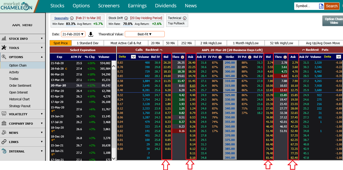
    First, for the symbol of interest, go to the option chain (for example AAPL https://marketchameleon.com/Overview/AAPL/OptionChain?ref=from_learn). On the option chain, when you click on any one of the bid or ask of the call option or put option (see the columns in the screenshot below), the payout diagram screen will appear as an overlay to the option chain.
    Where can I find payout diagrams step 1
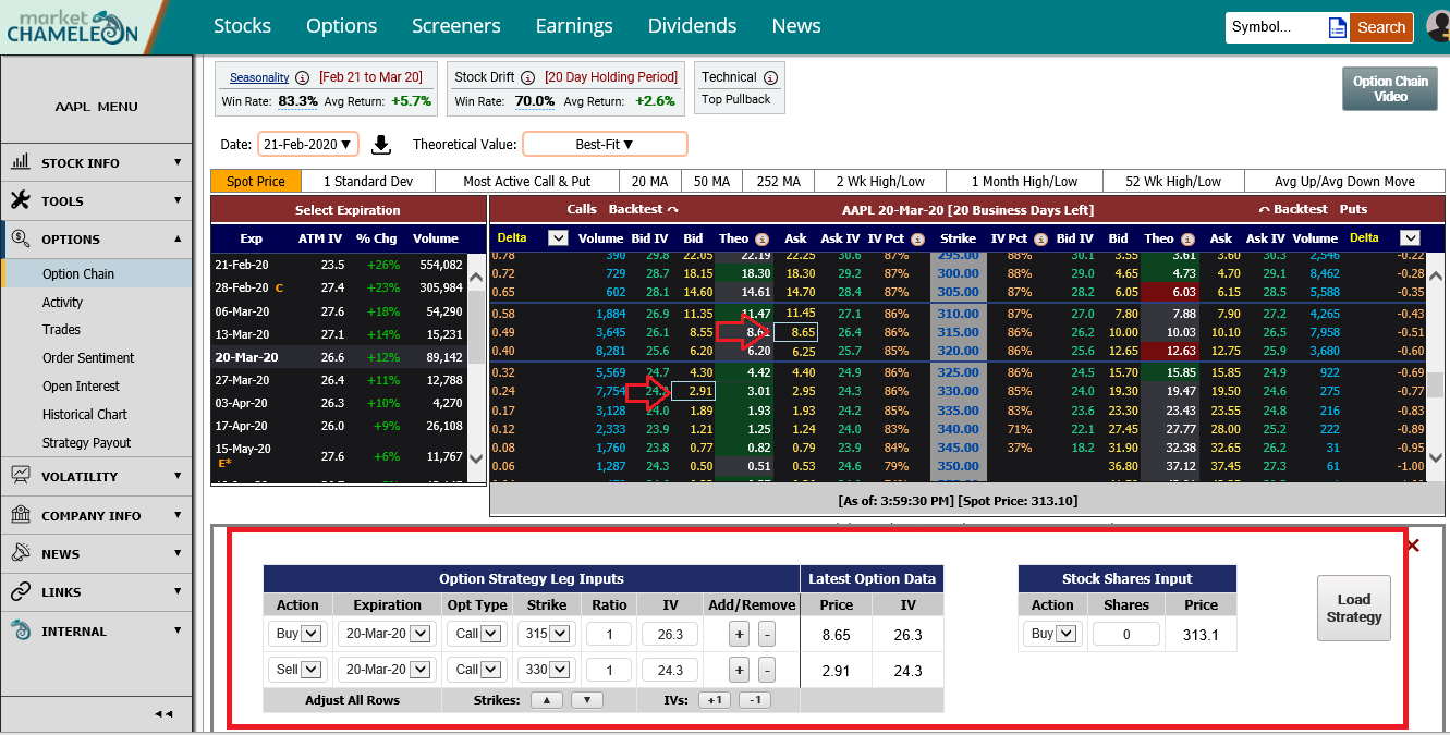
    Note: you can click on more than just one option market price and the system will automatically populate that option into the payout diagram selection table (See the screenshow below).
    Where can I find payout diagrams step 2
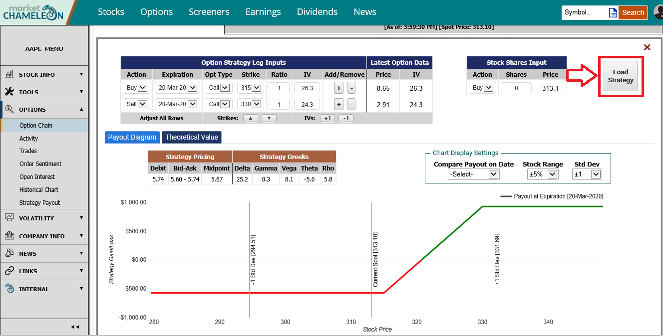
    After you have selected the options of interest, click the Load Strategy button, and the payout diagram will be loaded (see screenshot below).
    Where can I find payout diagrams step 3
  • Watch the video to find out more about payout diagrams